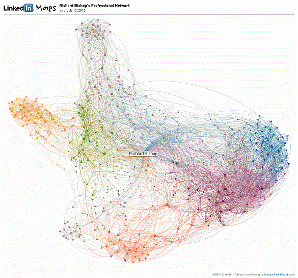
LinkedIn InMaps interactive visual representations of your LinkedIn connections, based on the relationships between your connections. LinkedIn uses information about how people in your network are connected to you and each other to create your individual map. Groups like colleagues, people you went at school with, or friends are separated into colour-coded clusters, as people within these groups are also interconnected with each other. My colour-coded groups include P&P, Acuma, HP, Intechnica as well as Lloyds and HBOS.
Here’s a link to my map.
http://wp.me/p2ADxu-5f
People with more connections are represented by larger dots and hovering over the dots allows you to see the names of connected people. Clicking on those names shows you other people that they’re connected to visually. This is a great way to understand your network and reconnect with those people and groups that you’re losing touch with,
As well as being a useful tool, it can come up with some surprises….
Here’s my current map.
I couldn’t help thinking that it looks rather like a dog!


